
API Banking Portal Redesign


Background
Who is SVB?
SVB provides banking, financing, and treasury services to clients across technology, life sciences, venture capital, and other innovation-driven industries in the U.S. and abroad.
A Platform for Developers
The SVB Developer Portal serves as a platform connecting developers and internal teams within the bank’s API ecosystem. Developers use it to explore and integrate SVB’s APIs, while internal teams manage documentation and monitor usage.
Designing for this platform required system-level thinking to maintain consistency across modules like documentation, dashboards, logs, and notifications, creating a cohesive experience that could scale across different user types and workflows.
SVB’s existing API portal held a large amount of content that was not intuitively organized or presented, and lacked many of the tools and features that leading API portals were offering.
The Problem
SVB is a commercial bank who needs the ability to provide developer-friendly features, clear documentation and effectively market their API offerings in order to improve customer satisfaction, increase API adoption rates and to scale their product.
Team and Role
Team Structure
The team included four designers, several developers, a product manager, and a project manager. As a design team, we collaborated on the full user experience and component library, with each designer owning specific pages and features.
Collaboration
Our design team met daily to share progress and feedback. Cross-functional check-ins and weekly reviews with the SVB team kept us aligned, validated feasibility, and ensured our work met project goals.
My Role
I focused on the API Documentation, navigation, API Explorer, App Management, Changelog, Approvals flow, and Notifications, collaborating with internal and external teams to create a cohesive and intuitive experience.
Research & Analysis
Current State Analysis & Landscape Review
We began by evaluating the existing API developer portal to understand what features already existed, what was missing, and where the biggest opportunities for improvement were. The team divided the portal into sections and documented observations and questions individually.
At the same time, we reviewed leading API portals such as Stripe and Square to identify common patterns, standout features, and best practices.
These insights shaped our design direction and helped the team build a stronger understanding of API portal standards early in the process.

Research & Analysis
Interviews, Synthesis & Personas
To help better understand the portal’s users, we first analyzed the four main personas that SVB brought to our attention. We then held interviews with current SVB API banking customers as well as SVB’s Sales, API Banking Product Management, and Technology teams. The information gathered from our interviews was then synthesized in order to identify what was most important to users.


Success Criteria & Our Strategy
1
Build a clear, organized catalog of SVB API services with supporting documentation.
2
Deliver self-serve workflows for managing credentials and scope (previously required SVB's support).
3
Launch a modern, high-performance portal that improves customer satisfaction.
4
Drive API Banking growth with a GTM platform that boosts product visibility.
5
Develop a marketplace for SVB and partners to quickly publish products and content.
Our strategy centered on driving SVB’s API growth through a better developer portal experience. By making APIs easier to discover, understand, and integrate, we aimed to increase adoption and, in turn, revenue. We focused on organizing services and documentation, enabling self-managed credentials, and laying the groundwork for a marketplace that would expand SVB’s reach and product visibility.
By transforming the developer portal into a seamless, self-serve platform, we helped position SVB’s API ecosystem as a key driver of growth and revenue.
Information Architecture
Sitemap & Content Model

We created a sitemap in order to understand the many different areas of the portal and how each page would connect with the overall architecture of the site. As it was created at the beginning of our project, the sitemap continued to change and evolve as we designed and uncovered new learnings about what was most intuitive for users regarding navigation and site organization.
We then created a content model to help define how information would be structured and connected throughout the portal. This helped us to clarify SVB's content needs and visualize how different elements worked together within the system.

Style and Component Library
SVB already had an existing style and component library, so our first step was to migrate this library to our workspace and get familiar with it. As we worked through the project, there were instances where existing styles or components didn’t align well with the API portal as well as situations where entirely new components and styles needed to be established. This resulted in a library and styles that continued to change and grow throughout the project.
We were initially provided with an existing style and component library that provided a foundation for components.


As we designed, many of the screens we created required us to create new components and styles that were unique to the API portal.
Design & Feedback Process
Broken down into two week sprints, our team spent the first portion of each sprint reviewing the expected deliverables and success criteria, and using those to create initial designs. After reviewing those designs with the client, our team would use the client’s feedback to iterate and improve. We would then hold a final client review at the end of each sprint which would ultimately result in finalized designs.

We began each screen with low-fidelity wireframes to establish structure, layout, and core functionality. These wireframes were shared with the team for feedback and alignment before moving into high-fidelity design. This iterative approach allowed us to validate ideas early, refine quickly, and save time by focusing detailed design work only on approved screens.


Design Solutions
Our design solutions were shaped by research, user insights, and SVB’s requirements. We combined these findings with our team’s expertise to guide decisions around structure, functionality, and visual design.


Profile & Notification Management
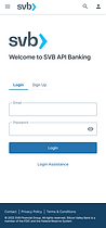
Users can easily create and sign into their SVB accounts, and from the top navigation bar they have the ability access their Profile & Settings panel where they can view notifications, manage their profile and log out.


App Notifications & Status
The home page surfaces real-time API statuses and app notifications, giving users quick access to their most active integrations. Selecting a status or app opens detailed views for deeper insight.
This streamlined visibility helps users monitor key activity at a glance and quickly address issues as they arise.


API Documentation
The API Documentation section contains in-depth information on each of the available APIs. Users can access Getting Started guides, API overviews, and the documentation they need to implement APIs.


The API Documentation homepage acts as the central hub for discovering and accessing APIs. We overhauled its structure, categorizing APIs based on developer feedback and surfacing common actions for quick access.
This redesign streamlined navigation, helping users find relevant APIs faster and complete frequent tasks with minimal effort.
Unique documentation for each API was available for the user to:
-
Explore the API’s purpose and capabilities
-
Review detailed specifications
-
Access version history
-
Experiment with endpoints through the built-in API Explorer
We reorganized and redesigned these pages to make information easier to find and navigate. Previously, they were difficult to use and left developers unsure where to locate key details.
The updated structure made the experience more intuitive, helping developers explore, test, and integrate APIs more efficiently while reducing support needs.


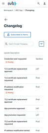
Logs, Insights & Changelog
Users can view logs for API status’ as well as for any changes that have been made (by them or other teammates) to their APIs. Additionally, the Insights page provides users with valuable insight charts measuring error rates, error codes and latency.
By adding logs and performance insights, we gave developers a new level of transparency and control over their APIs. They could now monitor activity, understand errors, and improve reliability using data that was previously unavailable


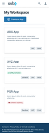
Managing & Creating New App
Within the Workspace users can view all of their apps and manage each app’s API products, collaborators, name and description. They also have the ability to create a new app via a quick three step process.
The new workspace gave developers a centralized place to manage their apps, making it easier to oversee configurations, collaborate with teammates, and create new apps quickly.


Admin Queue Management
Business Admins manage developer requests to promote or modify apps across environments, many of which require multiple levels of approval.
Streamlining this process gave them a more efficient way to manage and review requests, reducing bottlenecks and improving communication between teams.
%202.png)


Challenges, Solutions & Reflections
Challenges

Solutions

Reflections
This was a challenging project, particularly due to the complexity of the use case we were designing for, time limitations and continuously changing goals. Ideally, we would have had ample time to do more research in the beginning and would have had the necessary resources to pull in more professional opinions and perform user testing. Additionally, the opportunity to participate in more than one round of revisions per sprint would have allowed us to further improve upon our designs and ensure all problems were being thoroughly addressed.
Looking back, it’s clear how deeply complex this project was and while our team faced our fair share of challenges, our end result is something to be proud of. This was a huge learning opportunity for the team as a whole and taught us valuable skills that will certainly make us better designers as we take on future projects.