
PREMIER Bankcard
Cardholder Portal Redesign

First PREMIER Bank is a bank known for specializing in a wide range of subprime credit cards marketed to individuals with low credit scores.
Customers with a PREMIER Bankcard can begin rebuilding their credit and work towards a credit limit increase after 12 months of responsible use.
PREMIER Bank offers an online cardholder portal as well as a mobile app for necessary banking services such as viewing their balance and recent transactions, making a payment and viewing their statements.

Web Modernization 2021 Engagement
Historical Context
An initial engagement with PREMIER Bankcard concluded in October 2021. The overall goal of this engagement was to define the future state vision of the PREMIER Bankcard cardholder portal experience and set the foundation for future design and development phases.
Through concise discovery, ideation and definition phases, the teams worked to provide the following deliverables:
-
Information Architecture
-
Feature Prioritization
-
User Flows
-
Visual Design Direction
-
Wireframes & UI Compositions
-
Style Guide
-
Responsive Design System
-
Customer Archetypes

PREMIER Bankcard Customer Archetypes


From Goals to Needs

GOAL
Easy login and enrollment
As a new PREMIER customer, I need the ability to enroll and login in easily so that I can manage my account online.
GOAL
Make and set up payments easily
As a customer, I need to understand my balance when planning a purchase and I need to view my account status, balance and available credit so I am able to use my card and know how much I can charge on my account.
As a customer, I need to be able to plan and feel confident with my expenses when an unexpected emergency or expense occurs.
GOAL
Easy financial planning & self service
As a customer, when a payment is due, I need to have the ability to schedule and make a payment with ease and understanding.
As a customer, I need to have the ability to setup and manage my account to make the payments when due.
2021 Engagement Designs
The 2021 engagement resulted in a limited set of high fidelity mockups for some of the most key screens. These initial designs (as well as the new design system) gave our team a huge jump start as we began to review feature requirements and ideate what the various pages of the website would look and feel like.


Cardholder Portal Design Engagement 2022-23
Portal Design & Build Goal
To realize the MVP future state vision of the PREMIER Bankcard portal experience by leveraging Agile methodologies, cross platform development frameworks and User Centered Design practices to achieve enhanced customer experience, speed to market and lay foundations for future enhancements
The Team
Concentrix Catalyst

PREMIER Bank

High Level Engagement Timeline
2023

Continuous Discovery Approach
Following a continuous discovery approach, our team remained agile as we had frequent check-ins with the client to understand what changes needed to be made to the existing feature set as well as what additional features needed to be incorporated for MVP. The majority of communication between the Catalyst design team and the PREMIER team happened via Figma comments. This allowed for quick feedback and subsequent updates to be made.

Existing Experience
The existing cardholder portal experience was drab and non-intuitive. Many of the screens were extremely text-heavy and didn’t provide the user with a clear indication of what steps should be taken next. Additionally, the existing navigation made it difficult for users to complete their tasks and find the information they were looking for.


Setting the Foundation
Prior to beginning our designs, we established a viewport framework which demonstrates what the visible area would be for each of the three screen sizes we were designing for (desktop, tablet, mobile). Additionally, we created guidelines on spacing and margins as well as our expectations on how the website would scale responsively.


Streamlining Navigation
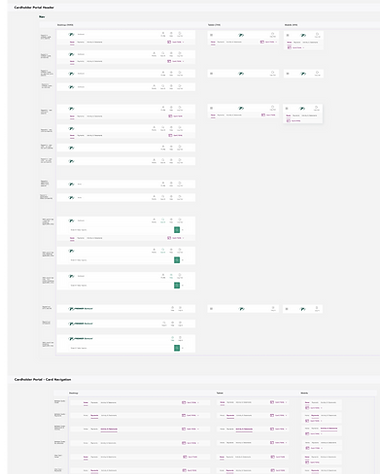
Though navigation structure and design was a part of the 2021 engagement, our team made revisions to further streamline it. This resulted in navigation that took up less screen space while also providing the user a more intuitive navigation experience. Many variations of the navigation were designed in order to accommodate each step of a user’s’ journey.
Before (2021 engagement)

After (2023 engagement)

Expanding on High Fidelity Designs
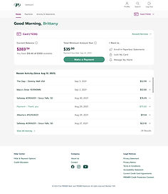
A Central Hub for the User
The user’s first impression as they log in to the cardholder portal is their dashboard, so our team placed a lot of emphasis on ensuring this screen included the most vital pieces of information that users want access to as soon as they log in. Details like account balance, minimum payment and their account activity were made to be prominent and easily actionable.
Users who have multiple Premier accounts are first presented with a dashboard which shows all of their accounts at a glance. From there, they can choose to click into a specific account to view more details.


Making & Managing Payments
One of the main goals for PREMIER customers is to make on-time payments in order to improve their credit. That said, creating an easy-to-use payments experience was one of our top priorities when designing the portal.
The Payments area of the portal is comprised of multiple key functions, including making a payment, managing payment accounts, scheduled payments and payment history. Our goal was to reduce the complexity that users were currently running into when performing payment tasks.

Account Services
Within each Account Home lives an Account Services menu, which allows the user access to various different account related functions. This includes services like requesting a credit limit increase, managing and signing up for PREMIER credit protection and locking your card. This menu was built to be dynamic and in the future, the items showing in this list can show or hide based on the user’s unique account status.


Activity & Statements
Another important task for the user is to view their current and past Activity and Statements. This page was redesigned to more clearly show the user the details of each of their transactions, and so that they could easily download past statements.


Account Management & Customization
Through a combination of improving existing features as well as creating brand new features related to account management, we developed an experience for users that makes it easy to adjust their account settings to best fit their individual wants and needs.
This included allowing users to enable paperless communications, updating their contact information and customizing their text message alerts. Each of these settings are on an account level, and in the existing experience it was sometimes unclear as to what account they were updating. With the new design, we’ve mitigated the risk of users mistakenly updating account details for the wrong account.


Designing Responsively
As we were creating a modernized version of the cardholder portal, another team was working to design and develop a mobile app. One goal was to encourage mobile users to download and utilize the mobile app rather than the website. To do so, mobile web users are prompted to download the app via a dismissible banner.
With that in mind, our team utilized a desktop-first approach. After designing for desktop, we then designed two additional scaled down versions to accommodate tablet and mobile users.


What We Delivered
At the conclusion of our engagement with PREMIER, we delivered over 650 different screens across three different screen sizes. Additionally, we handed off a prototype that demonstrates the key functions and main user flows within the portal. We also provided a component library as well as a sitemap and technical guidelines pertaining to responsiveness, spacing and viewports.


Challenges & Learnings
Design Finalization
Challenge
Though our roadmap was well-defined and we utilized design reviews (sometimes multiple) to receive client sign off for designs, it wasn’t uncommon for the client to go back and revisit previously “finalized” designs and request changes. This would typically require more design time and ultimately effect our timeline.
Learning
This challenge demonstrated the importance of clearly establishing boundaries and parameters with the client, especially in regards to declaring a design “final” and what it actually means for a design to be finalized. In the future, we can work to better define and enforce these parameters.
Approval Delays
Challenge
The team at PREMIER that we were interacting with on a day-to-day basis was always quick to provide us with what we needed, but there were many times where decisions required input from other PREMIER teams (Compliance, Marketing, etc.). Awaiting this input caused roadblocks and added significant time to our design process.
Learning
When experiencing similar situations in the future, it may be helpful to get the appropriate teams involved at an earlier point in the project to try and get ahead of any delays. Additionally, providing guidelines to these decision makers as far as when we expect to receive their input back by would help give us a more predictable timeline allowing us to plan better.
Dev Handoff
Challenge
Once it came time to hand off our designs and component library to the dev team, they presented us with quite a few questions we weren’t anticipating. A majority of these questions were regarding our design logic (e.g. “When should this button style be used?”). Also, we found they were unfamiliar with using Figma.
Learning
Moving forward, it would be helpful to meet with the dev team at the beginning of the project to help understand their expectations at handoff. This would help us to better document our component library and designs so components are easier to implement. Additionally, it would be beneficial to allot time to ensure the dev team knows how to navigate Figma.