top of page
Fusion
design system
Creating and managing a design system from the ground up
.png)
.png)
.png)
Background
Processing billions of calls, chats, and other contacts annually, Concentrix launched an initiative in 2024 to build its own product suite, targeting the root causes of inefficient customer interactions and dissatisfaction. Soon after a new internal organization was formed to help drive this effort, it became clear that developing a design system was a top priority. Although Concentrix had developed many internal products over the years, each used it's own design system, component library, or neither. This resulted in major inconsistencies and a fragmented user experience across the tools that would later be forming the foundation of the new product suite.
Developing and implementing a centralized design system would solve these inconsistencies by unifying components, styles and patterns across the entire product suite.
My Role
Design System Lead
As the Design System Lead, I was a key contributor in establishing a scaleable, brand-aligned design system to support Concentrix's new product suite. I developed a token structure that was optimized for developer implementation and reflected Concentrix's brand identity, and built a comprehensive Figma component library. Additionally, I created thorough documentation for every component and introduced feedback processes to ensure continuous improvement and team alignment.
Choosing an Open Source Design System
We first decided that the best approach for us was to leverage an existing open source design system rather than creating one from scratch.
As a team we identified several open source design systems to evaluate using a decision matrix. We evaluated each one on criteria such as:
-
Designer and developer library availability
-
Framework (React preferred)
-
Storybook and Backstage compatibility
MUI and Material Design achieved the highest scores. Ultimately we landed on MUI due to it's extensive developer documentation, familiarity with it amongst our team members and integration compatibility with Storybook and Backstage.
.png)
Establishing Our Style and Design Tokens
Our top priorities were consistency, efficiency and scalability across all products. To support this, we focused on building a robust set of design tokens that reflected Concentrix's visual style.
While our branding was quite mature and we already had foundational assets like a color palette and typography, we were still lacking elements like status colors and iconography that are vital to a user interface. Our team worked closely with the Marketing team to fill in the gaps and align on styles that felt true to Concentrix's brand while also being accessible and user-friendly.


MUI's token structure was already well-defined, so once we obtained the MUI Figma library our main focus was customizing the primitive values to align with Concentrix's branding. For example, changing the HEX code for their primary color to the HEX code of Concentrix's primary color, and updating the default corner radius from 0px to 4px. Once our token variables were finalized in Figma, we delivered the updated CSS files to our development team for implementation.
Our work resulted in a cohesive, accessible visual foundation that brought consistency across products and translated our brand into a scalable, developer-friendly design system.
Component Curation
To provide it's users with flexibility in their design systems, MUI provides numerous style variants for many of their components. For example, the default MUI Figma library contains 60 variants of the text field and 246 variants of the checkbox.
To reduce decision fatigue and promote consistency, we audited our components to identify which components and variants were essential to our products. Through collaborating with designers across product teams, we streamlined the library and eliminated unnecessary component variants for a more efficient system.
Text Field - Before
60 variants

Text Field - After
14 variants
Developer Implementation
As we finalized stylistic updates and refined our component library, our development team began implementing each component and configuring design tokens within Storybook. This would provide our product teams with a single source of truth for UI elements and support easier collaboration between designers and developers.


Once our base set of components had been built out by developers in Storybook, we then conducted an audit of each component. This was to ensure behavioral and stylistic alignment between our Figma library and Storybook.

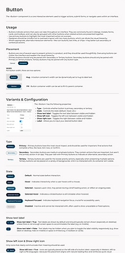
Documenting the System
Documenting the design system was an important step in ensuring clarity, consistency, and easy of adoption across teams. The documentation we created helped designers and developers understand how and when to use each component, what variants are available, and the rationale behind design decisions.
By creating comprehensive documentation for all of our components and styles, we empowered teams to work more efficiently and confidently within the system.
.png)
Designing and Developing Custom Components
With our foundational components in place, we shifted our focus to designing and developing more complex, product-specific components that weren't available in MUI's out-of-the-box offerings. These components are tailored to the unique needs of our product suite and required collaboration between design and development to ensure they aligned with our design system's standards while also meeting functional requirements.
Our first priority was creating a product-agnostic navigational framework, consisting of a top app bar as well as a side navigation in which the nav items could be customized to the product. Together, these components form a cohesive navigation component that offers users a consistent and intuitive way to move through our product suite.

Beyond the navigation framework, we focused on designing and developing advanced shared components to meet evolving product needs. In response to feedback from product teams, components such as the File Uploader and Page Header were created to serve multiple products across the suite


With multiple products relying on different types of data visualizations, another key focus was the design and development of a comprehensive charts package that provided our designers with a flexible, reusable set of chart components.
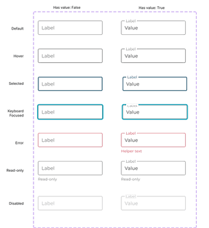
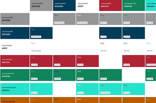
Designing for Accessibility
Accessibility was always top of mind throughout designing and developing our design system. We focused on meeting criteria such as:
-
Ensuring our colors met or exceeded WCAG AA contrast ratios
-
Interactive elements supported keyboard navigation and visible focus states
-
Icons and colors were never used as the sole method of conveying information
-
Semantic HTML and ARIA roles were considered in component structure
.png)
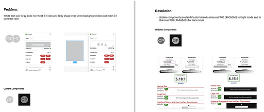
A part of finalizing our design tokens was making sure that they supported an accessible interface. Components were regularly tested for compliance, and any accessibility issues that arose were workshopped and resolved to meet accessibility standards.
Governance and Feedback
We adapted a hybrid governance model, combining centralized oversight with federated collaboration. The design system team maintains the component library, ensures consistency, and enforces best practices. Designers from each of our products are encouraged to collaborate with the design system team to help create and evolve the system to meet their product's needs.
Designers have multiple channels to share ideas and surface issues, including a dedicated feedback form and ad-hoc design reviews. These sessions provide space to propose new ideas, collaborate on improvements, and address any design system blockers in real time.

Current State and Next Steps
Our team recently released the first set of design system packages, including design tokens, base components, and a navigation module. With these foundational elements in place, we're now partnering with product teams to begin integration the system into their applications, bringing us closer to a truly unified product suite.
Looking ahead, our focus is evolving the design system to meet the growing and changing needs of our products. This includes developing more complex components and gaining deeper insight into each product's functionality, so we can continue to provide teams with the tools, guidance, and documentation they need to succeed.
bottom of page