Caruso Signature
Loyalty App Design
Caruso is a luxury commercial real estate company. Their properties host a variety of merchants such as clothing retailers, restaurants and movie theaters. Additionally, they manage luxury residential buildings across southern California.
Caruso came to our team for help with designing and building a loyalty program and an accompanying application that would drive engagement, spend and insights -- ultimately generating more value for Caruso and their visitors.

Overall Goal
Design and build a program that offers enticing rewards for guests, generates meaningful insights for use across the enterprise, integrates technological platforms to allow for a seamless guest experience, and is financially sustainable for Caruso.
Required Features
Opportunities to Earn
-
Members can earn for completing engagement activities like app download, refer a friend, or making purchases.
-
Members who link a card to their account will earn coins on all linked card purchases made on their properties at participating tenants.
-
Members can earn for completing on-time rent payments, renewals, and referrals.
Redeem for Rewards
-
Members can utilize the app to view available rewards and redeem for rewards such as:
-
Restaurant vouchers
-
Movie tickets
-
Entry to members only events
-
Other Functionality
-
Sign up/log in
-
Profile/card management
-
Help center
-
Property directory
-
Transaction history

Methodology & Approach
Business Needs
-
Connect Caruso ecosystem
-
Collect guest data to inform & optimize
-
Improve resource allocation
Program Goals
-
Improve guest insights
-
Increase spend per guest
-
Drive awareness, preference, and heart share
Target Audience
-
Guests with the ability AND willingness to spend
-
Frequent guests, high-spenders, event loyalists
Seamless Technology
-
Card-linking integration
-
Integration with Cheetah loyalty platform
-
Flexible platform with sophisticated segmentation
Best Practices & Influences
-
Simple to understand & easy to use
-
Move beyond just monetary benefits to drive engagement
-
Personalize content
-
Iterate & evolve
Navigation & Information Architecture
To start, we established a sitemap and built out user flows. This helped to ensure we covered all feature requirements and helped give us a better sense of how many and what types of screens we needed to design, as well as how these screens would be connected to one another.

User Flows

Sitemap
Creating & Iterating on Wireframes
With our navigation, information architecture and feature requirements finalized, we began putting together a rough idea of what each of our screens would look like. These were presented to the client in order to gather feedback which was then used to iterate and finalize the structure and contents of each screen. Additionally, our development team utilized our wireframes to begin development as the Branding workstream (which would effect our high fidelity designs) was completed.

Developing a Design System
As we began the design process for the app, our internal Branding team was wrapping up branding decisions with the client. This meant we had to hold off on incorporating colors, font styles, imagery, etc. into our designs for several weeks and our development team began to build out our lower fidelity screens.
Once all branding decisions were finalized, we built out our design system which consisted of reusable components, colors, font styles, imagery and overall guidelines for every aspect of the app’s interface.

Designing in High Fidelity
Once we had established our design system, we began flowing our components, colors, font styles, etc. into our screens to create polished high fidelity mockups (using a mobile-first approach) as well as a fully functioning prototype. Rather than developing mostly wireframes accompanied by details from the pattern library we created, we took the next step and designed extensive hi-fidelity prototypes of the entire experience.
App Entry
After the app completes loading, logged out users are taken to the landing page which contains general information about the loyalty program. Users then have the option to sign up or log in.


Dashboard
Once logged in, users can access their dashboard which contains all of the main features of the app. From here they can see their coin balance, browse rewards and earning opportunities, view any vouchers they may have currently, see their most recent transactions and navigate to the other areas of the app.


Earn Opportunities & Activity History
With nearly 10 different ways to earn Caruso Coins, we wanted to both educate members on the various earn opportunities, and incorporate CTAs within the relevant earn opportunities to allow members to easily take the actions needed to earn. Additionally, users can access a history of all of their coin earnings and spend via a Recent Transactions page.


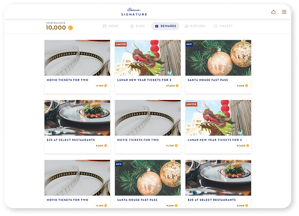
Redeeming & Using Rewards
Members can redeem their coins within the app for several different types of rewards. Depending on the reward, certain operational requirements had to be met within the redemption flow. Therefore slight variations existed between each redemption flow within our designs.
When users would like to use their reward voucher, in most cases they will present their digital reward voucher to a Caruso or merchant or employee. These flows were customized to meet the unique operational requirements of each reward.
Profile & Card Management
In order for Caruso to customize the experience for each of their members, an extensive user profile section was built out and allows the member to optionally fill out their demographics, interests and preferences. Members can also manage their linked cards and view their unique member ID card which can be scanned on Caruso properties to streamline certain activities.

Designing Responsively
The Caruso Signature loyalty app was designed using a mobile-first approach and though we anticipate the majority of usage to be via mobile phone, it needed to be responsive and adapt accordingly for users on all types of devices.


.png)


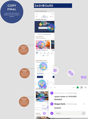
Incorporating Client Copy
Caruso was responsible for providing all copy throughout the app. This resulted in many copy changes and numerous rounds of edits within the hi-fidelity experience, which at times tied up the finalization of our hi-fidelity designs. We established a system to indicate the status of copy on a flow-by-flow basis and relied on Caruso to input their desired copy directly into our Figma file.

Asset Provision
We took an extra step for the client to provide them with various forms of assets that would ultimately help their team with the implementation and maintenance of the app. Our team selected the images that would make up a majority of the cards and tiles within the app and provided those to the Caruso team in all of the required dimensions. These image specs were also documented for their team to assist with any future updates to the app’s imagery. Additionally (for their internal purposes), a Caruso Signature implementation deck was developed in which we provided all custom assets for.


Next Steps
Upon completion of the UX portion of this project, the app was in the final stages of development and was targeted for a soft launch a few weeks later. Soft launch consisted of a “family and friends” phase which was conducted in preparation for the full launch in August of 2022. The app is now fully live and available in the app store.

