
Loyalty Experience & Navigation Redesign
Design System Build
Bagel Brands, parent company of Einstein Bros. Bagels, Bruegger’s Bagels and Noah’s New York Bagels, came to our team with the ask of streamlining their navigation structure and to create a better experience for their loyalty members.
Their existing navigation wasn’t consistent throughout a user’s journey, with menu items and design elements changing throughout. Their loyalty site was outdated, unintuitive and led the user to a lot of dead ends. Additionally, Bagel Brands lacked a design system which led to inconsistencies throughout the site. In order to improve both the navigation and loyalty experience, we built out a design system and used that as a foundation to create one consistent navigation structure as well as a modernized loyalty site.
Identifying the Top Three Problems

Multiple teams were managing different areas of the website, creating a disjointed experience for users. Additionally, the lack of a design system led to components and styles that differed from each other throughout the site.

The navigation structure was inconsistent, making it difficult for users to recall menu items and learn how to navigate through the site. A simple user flow entailed too many clicks and led users to dead ends.

The loyalty experience was outdated and lacked components to motivate and excite users about unlocking rewards. The page layouts and submenu also made utilizing the rewards system difficult and unintuitive.
Three Websites in One
Across the three brands (Einstein Bros., Bruegger’s, and Noah’s), some pages such as the homepage were separately managed and not related to one another. However, some areas of the site such as rewards and online ordering were all developed using the same code, just utilizing different styles in order to align with the respective company’s branding.
With that in mind, it was important to ensure throughout the engagement that our designs would work well across all three of the brand’s websites. While we only created high fidelity mockups for Einstein Bros., we made sure to also document styles and components within the design system for the other two brands so that developers could easily implement the designs for all brands.


Existing Style & Component Documentation

Though Bagel Brands didn’t have a design system, they did have style guides for each of the three brands. However, these were very lightweight and only included the basics such as colors, fonts and button styles. The style guides didn’t account for many components of their website such as input fields and modals.
When changes to their interface were required, annotated PDFs were provided by Marketing to the IT team to communicate the requested changes. Not only was the creation of the PDFs very time consuming, but it led to too much back and forth and a high level of questions between the Marketing team and the development team.
Previously Existing Style Guide
Building a Design System
Typography Documentation (after)


Importing Existing Styles & Components
To begin, we utilized the styles and components that Bagel Brands already had defined and built those out in Figma. We also added more extensive documentation as well as additional variations of certain items (e.g. desktop vs. mobile variations, hover states, etc.)
Adding in Additional Styles & Components
With such a limited set of styles and components, we then began creating new components such as input fields, checkboxes, modals and radio buttons. New components were added and adjusted throughout the design process.
Accommodating All Three Brands
As the styles and components were built out and finalized in Figma for Einstein Bros., we began creating variations for Bruegger’s and Noah’s as well. This involved using the components we’d already built for Einstein, but adjusting their styles to be on-brand with the specific company.
Typography Documentation (before)
Completed Design System
The completed design system creates many efficiencies for Bagel Brands, including:
-
One central location to document all styles and components, for all three brands.
-
A more streamlined and efficient way to document and communicate changes.
-
More in-depth and detailed documentation, including important component variations that were previously missing and annotations throughout to help with development.
-
The ability for developers to easily view/copy code, access text and property annotations as well as measurements, and stay up to date with the most recent designs via Figma’s dev mode.


Navigation Redesign
Understanding the Current State
To start, we began mapping out the site’s current architecture. This not only involved getting familiar with the navigation structure and visual appearance, but also involved identifying which subdomain (e.g. rewards.einsteinbros, orders.einsteinbros, etc.) each page fell within. The domain had a direct correlation with the team that managed the page (for example, IT managed the orders.einsteinbros domain), and subsequently revealed a pattern of where the inconsistencies existed.

We identified what menu items were most commonly found in the top navigation (vs. in the footer and within submenus) amongst each of the competitors. Additionally, we analyzed whether competitor’s navigation bars were static or if they changed throughout a user’s journey.

What We Learned
-
Each of the various subdomains were utilizing a slightly different navigation component.
-
Compared to other’s online ordering flows, Einstein Bros.’ ordering flow did not actually involve an over abundance of clicks.
-
Competitor’s navigation bars were either static across the entire site, or they purposefully changed depending on where the user is in their journey.
-
There was a common set of menu items in competitor’s navigation bars, and the menu items in Einstein Bros.’ navigation bar didn’t align well with competitors.


(Before) Desktop Navigation Variations
(Before) Mobile Navigation Variations
Iterating on Navigation
Evolution of the Mobile Navigation
We went through many rounds of iterations to reach our final designs for navigation. It was important to some stakeholders that the mobile website felt like a mobile app and was easy for users to navigate while on the go.
With that in mind, we explored navigation options both with and without a bottom app bar. Ultimately, we decided on navigation that included both a bottom app bar and top navigation. Though each of those components already existed on the current navigation, many updates were made to make each of them more functional for users and to encourage them to place online orders.

Designing Across the User's Journey
One of our main goals was to create one consistent navigation experience for the user. However, we also had to consider the fact that there were technical limitations between the various subdomains and that the user’s navigation needs change throughout their journey. In our final designs the navigation maintains a similar look and feel, however the navigation elements dynamically change in order to both remain technically feasible and to meet the user where they’re at in their journey (e.g., logged in vs. logged out, ordering vs. not ordering, etc.).
Desktop Navigation Variations (Final)

Mobile Navigation Variations (Final)

Loyalty Redesign
Evaluating the Existing Loyalty Experience
Since the existing loyalty site was due to be migrated over to a new subdomain for technical reasons, it made sense for our team to complete the Rewards redesign next in order to align with the site migration.
To start, we identified a few key areas we wanted to focus our improvements on:
-
Motivation for users to keep earning points
-
Streamlining the reward redemption process
-
Incorporating more surprise and delight offers
-
Creating a more modern look and feel


(Before) Rewards Homepage
Defining the Layout & Content
With our primary goals identified, we began ideating on the content we needed and utilized wireframes to determine how we could best fit the content into the Rewards page layout.
A few of the major updates and additions we decided on were:
-
Single page layout
-
All rewards items and actions will be accessible via one main rewards page
-
-
Streamlined reward redemption
-
All rewards can be viewed, redeemed, and added to the user’s cart directly from the rewards page
-
-
Points tracker
-
A visual indication of the user’s current point amount and how many points needed to achieve their next reward
-
-
Designated marketing area
-
A dedicated area for marketing content, such as surprise and delight offers and upcoming promotions
-


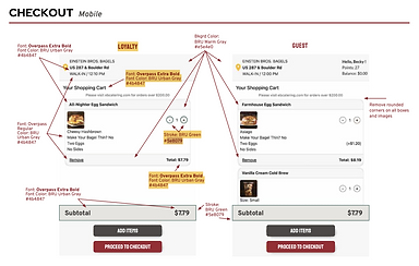
A Modernized Loyalty Experience - Final Designs
The final design for the Rewards page is modern and simplified to allow users to perform any reward related task directly from the Rewards home page. The bold imagery guides users’ attention to the most important area of the page – reward redemption.
Users can now clearly visualize how many points they currently have, as well as how many points until their next reward via the point tracker.
The new dynamic rewards component allows users to redeem points for rewards, add the reward directly to their order and see how many points are left to earn to redeem each reward (all within one component).
Additionally, a dynamic marketing content module allows Marketing to display customized content in order to engage and excite users about upcoming offers and promotions


Since the entire rewards.einsteinbros subdomain was due to be migrated over to a new domain, we went ahead and redesigned all of the pages within that domain as well (such as Log In).
The additional screens that were redesigned included:
-
Sign Up
-
Log In
-
Forgot/Reset Password
-
My Account
-
Gift Cards


The updated page designs utilize the new design system styles and components, creating a much more unified experience that is both visually appealing and easier to navigate.
Final Deliverables

New Design System
The addition of a design system creates efficiencies across the board for Bagel Brands, as they now have one source of truth (encompassing all 3 brands) for all styles and components which can easily be referenced, shared and updated.

Revamped, Dynamic Navigation
A single navigation component with variations that are built to meet the user’s specific needs no matter where they’re at in their journey. The updated navigation will ensure that users can easily accomplish their goals and find the information they’re looking for.

6 Complete Redesigned Flows
Each flow that existed within the rewards.einsteinbros subdomain underwent a complete redesign, creating a more simplified, intuitive and modern experience. This should ultimately lead to more engagement and satisfaction from loyalty members.
70 Unique Mockups
In addition to the “happy path” mockups for each of the redesigned flows, we accounted for every variation within a user’s flow and created mockups for each one of them. Additionally, mobile and tablet designs were created for each of the 70 mockups.
Challenges
Feature Prioritization
Identifying our direction and what areas of the website we wanted to prioritize proved to be a challenge at the start of the engagement. While redesigning the online order flow initially took precedence, the decision was made to pivot to the Rewards site and navigation. Coming to this conclusion required a lot of conversation across the organization, as well as an in-person workshop that helped solidify our top priorities.
Communication & Managing Expectations
From the beginning there was a disconnect between Marketing’s desires for the site and what was technically feasible for IT to develop given their time and resource constraints. Part of our role was to act as a liaison between the two teams in order to determine how we could best meet Marketing’s desires with the redesign, while remaining within the scope the IT had defined.
The Logistics of Separately Managed Domains
With 5 different teams managing the various subdomains, it was important that our designs kept each of them in mind. This involved understanding what was possible for each of the teams and how we could ensure global components such as navigation worked seamlessly across all subdomains. In some cases, certain data can’t be transferred between the subdomains, so this was another consideration we had to keep in mind when designing.
What's Next?
Increasing online orders is a top priority for Bagel Brands, making the redesign of their online ordering flow a key focus. The current experience was developed with minimal UX input, leaving significant opportunity to improve usability and better align the flow with the newly developed design system components.